Extra space around file list
Completed
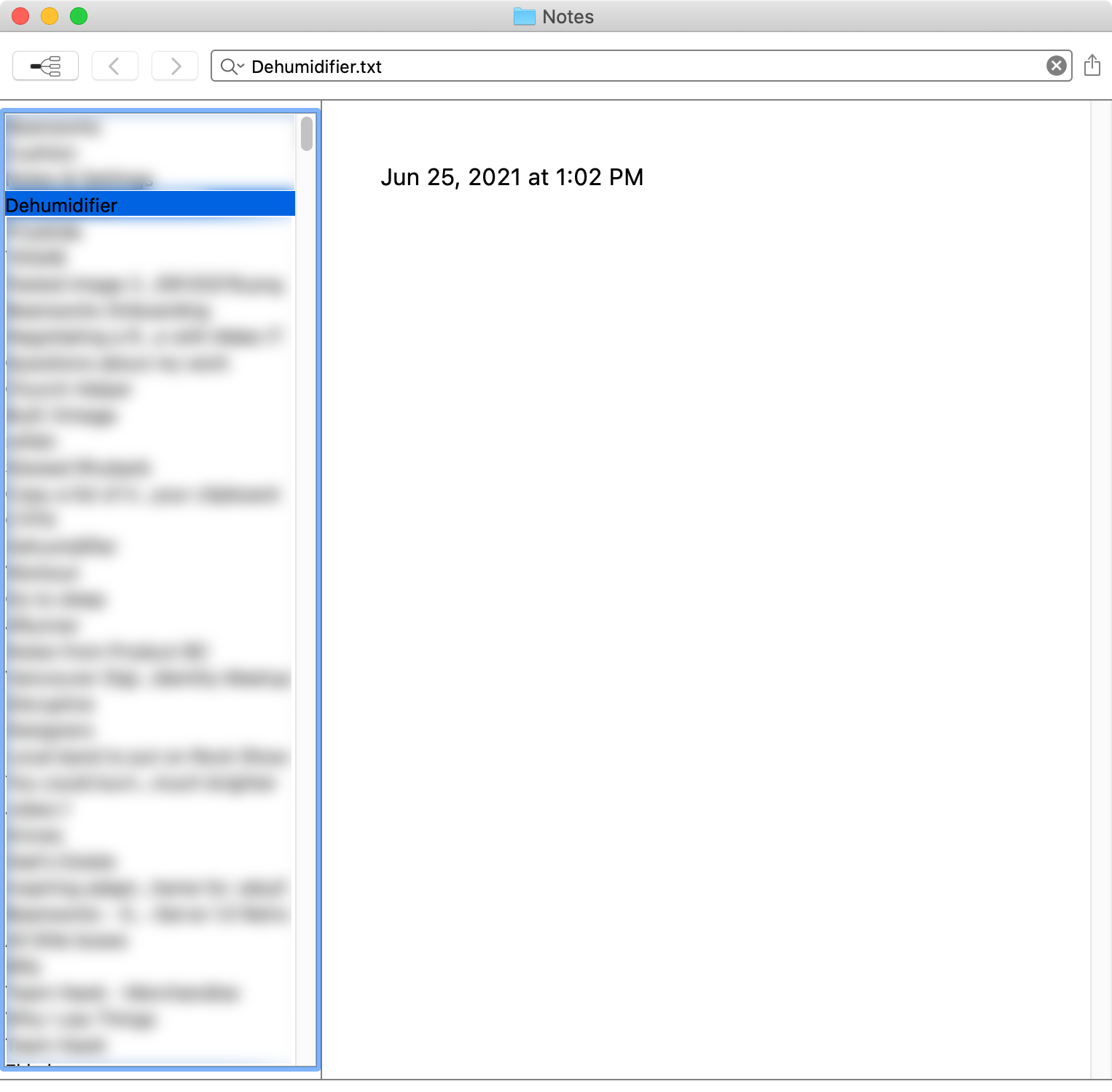
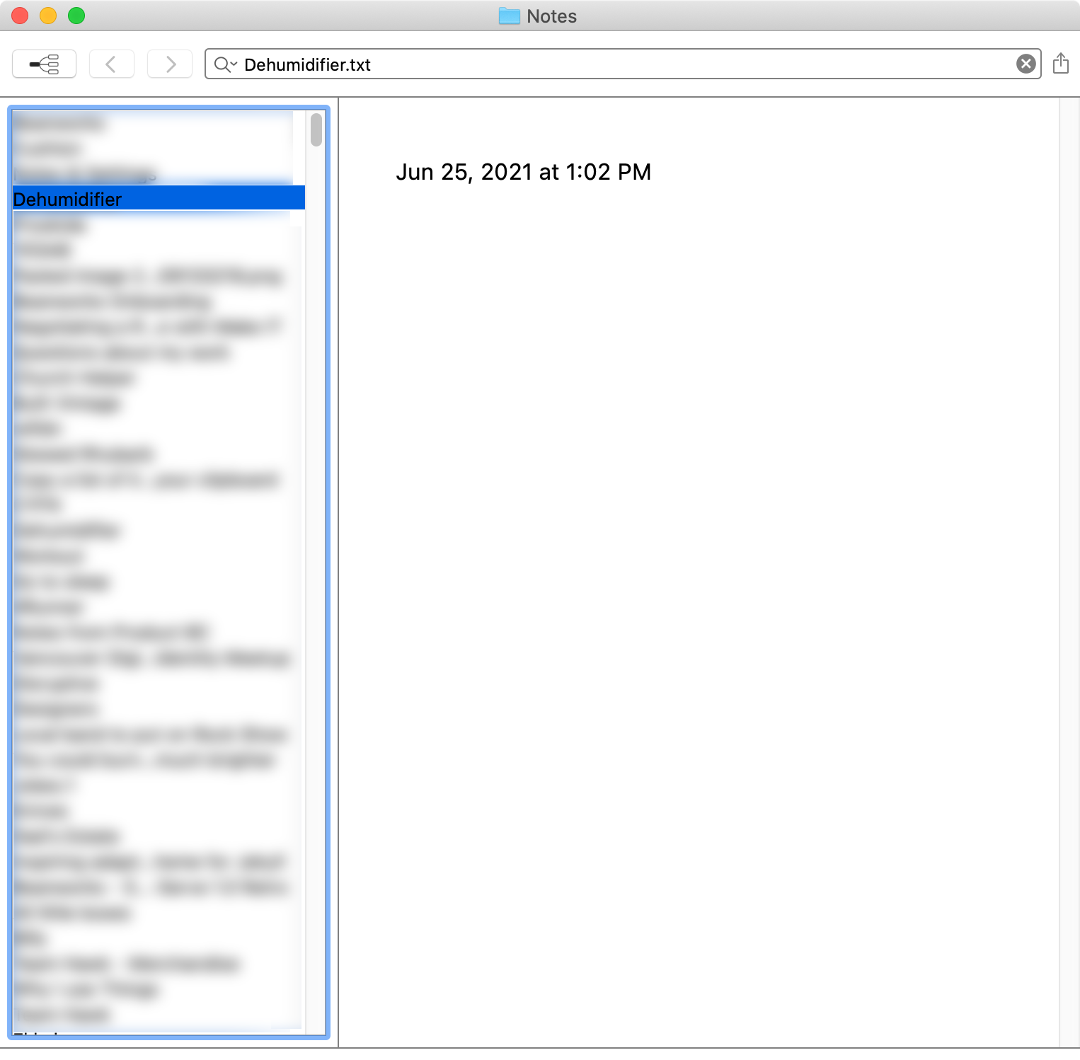
I've just downloaded Beta Mark II and have noticed that on macOS 10.15.7 there appears to be extra margin around the file list that is inconsistent based on the width of the file list. Based on the UI for the previous nvUltra beta and nvAlt, I would have expected the file list to work similar to other sidebars where there isn't an inset. This is happening in all themes.
I also wouldn't have expected an outline around the list when it was in focus, but I understand if this is a necessary addition for accessibility purposes.
I have tried looking through the hidden preferences to see if there was a setting for this, but it wasn't obvious to me which preference to set. I tried setting `NVTableColumnSpacing` to no avail.
On a separate note, the black text on a blue highlight for the selected note is difficult to read.
-

1. Is that the `Empty` theme? It's designed for testing, customization, and demonstration purposes. I wouldn't recommend it for actual use as is.
2. Different themes handle all of the coloring in different ways. Experiment to find what you like.
3. I have removed top/bottom margins. Will need to look more at the horizontal spacing. The old version used a more complex custom appearance that we have decided to simplify.
0 -
- Yes, but most of these issues apply across multiple themes. Screenshots added.
- I understand this and appreciate that these values are able to be customized in themes. However, the colours for the selected note in the default theme and many other themes don't meet the WCAG AA standard for colour contrast and could be improve just on that level, let alone the aesthetics.
One solution would be to have a way to use the user's selected Accent Color in System Preferences, though I recognize that may not be possible with the theming system (and would likely clash with the other non-default themes). Another solution would be to find other colours that have better contrast, like #FFFFFF/#005C99 for the default themes, #FFFFFF/#195B8A for Pretentious, or #FDF6E3/#53524B for Solarized, etc. so users don't have to be comfortable creating/editing themes but still benefit from having greater contrast between the colours. - Sweet. Look forward to the next version :)
Default - Dark
Pretentious

Solarized
 0
0 -

I thought I would add onto this thread. I would like very tight spacing on the file list. I am using the Hidden Settings but can't get the spacing to tighten up?
Am i missing a setting?
Thanks,
Rob.0 -
Hey Rob, I don't think the issue you're facing is what's described in this thread. Thankfully, there are hidden preferences you can set to address the sizing of the rows in the file list. See: http://nvultra.com/help/advanced-features#hiddenpreferences
0 -
Edit: Opened new thread on Hidden Preferences and Mark II
0 -
Pat Dryburgh -- just realized I ignored a part of your post.
The extra space to the right of your file list appears to be the scroll bar. I assume you have your system-wide defaults to show scroll bars either "Always" or "Automatically based on mouse or trackpad"??
I prefer to use the "When scrolling" option so that the scroll bars disappear, and are only overlaid on top of tableviews when I am actively scrolling.
As mentioned in the other thread, the focus ring can be controlled in the theme.
0 -
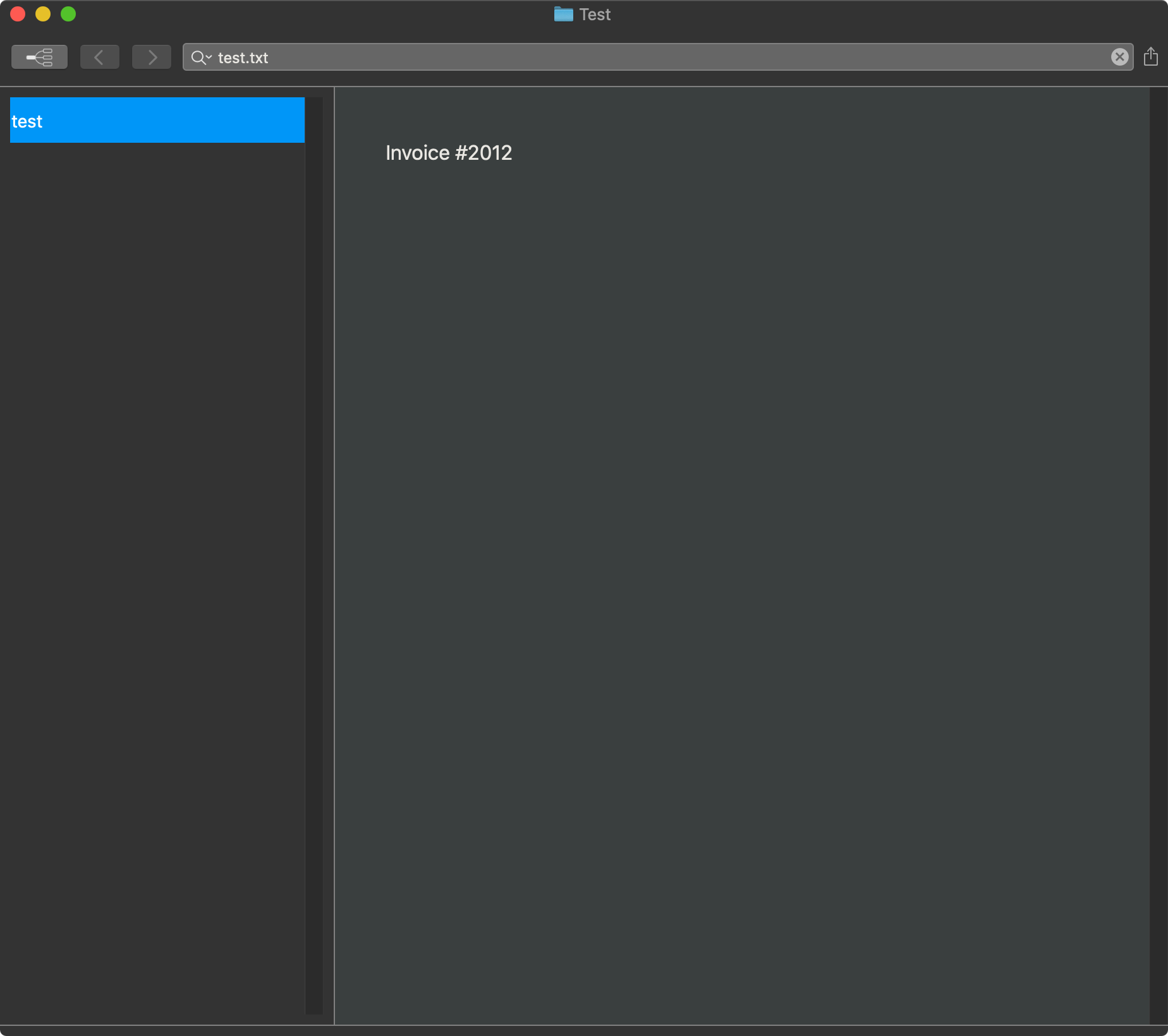
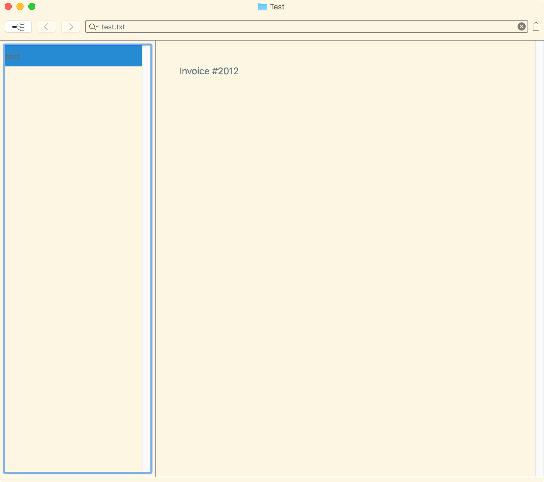
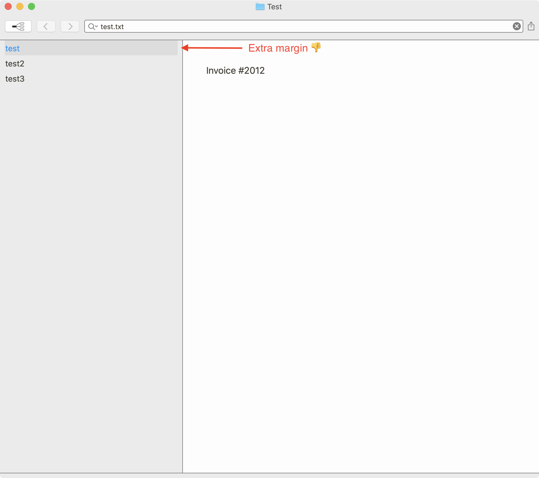
What I'm reporting here is the space around the list view. I see in v1.0.0 that the top and bottom margin is removed, but there is still extra margin on the left and right.
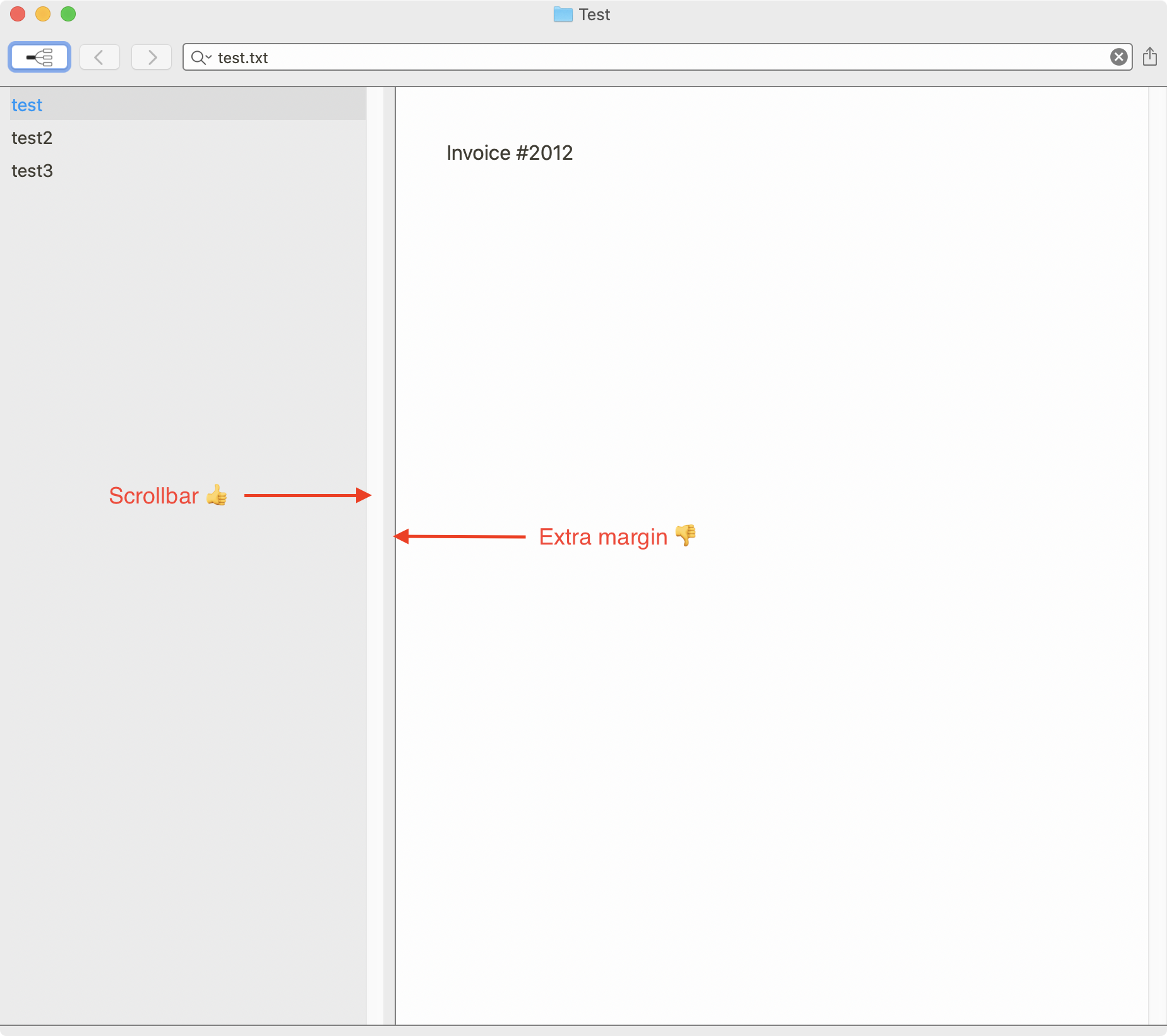
When I switch my system preferences to only show the scrollbars when scrolling, there is still extra margin around the list view that I assume is to act as “padding” until you add left and right padding to the rows themselves.
As mentioned in the other thread, the focus ring can be controlled in the theme.
That's great! Thanks 🙂
0 -
Oh, and the grey bar that runs along the bottom is also a bit weird. Not sure what its purpose is or how to turn it off.
0 -
Pat Dryburgh -- I think I got it now. New theme support in next 1-2 versions should allow more control over this using `horizontalPadding` and also `verticalPadding`.
As for the bottom line, that is the frame surrounding the component stackviews that organize the layout of the GUI. You'll notice that because the windows are rounded in the corners, that the table and the editor do not go all the to the bottom. The background color for the window shows through here, as well as in the "header" at the top of the window. You can't turn it off.
0 -
Today's release adds support for `horizontalPadding` to the `tableView` element to adjust this as desired
0 -
Fletcher Penney The new updates with the `horizontalPadding` and the increased contrast in the default theme look great!
0 -
Glad to hear it. There is a bit more control in the themes, and there are some additional features coming soon for the syntax highlighting aspect of themes.
0 -

EDIT: I just realized that his thread was in the nvUltra topic, but I actually was looking at fixing scrollbars in the MultiMarkdown Composer Beta. Sorry!
Hi! Sorry for revisiting this old thread, but I came to ask about scrollbars.
Is it possible to make the sidebar scrollbar gutter match the color of the sidebar background? That seems to be what most other apps do currently.
It also looks like Apple's own apps at least (like Mail and Safari) also automatically hide the scrollbar in sidebars when it is large enough not to need to scroll, even when the system is set to always show scrollbars.
I've tried a few of the different theme settings, but can't seem to get the scrollbar gutter to change colors.
EDIT: In further attempts at trying to match the sidebars of other macOS apps, I tried setting the alpha on the backgroundColor properties for the window and the tableView. The window background becomes somewhat transparent, but the tableView in the sidebar doesn't. Would it be possible to do so?
Thanks!
0 -
1. I'll have to look into the scrollbar background/gutter. I always leave scrollbars set to “When scrolling” system wide, so it's a non-issue for me and I don't think about it. Currently it appears to follow the light mode/dark mode setting of the theme/OS.
2. This is a low priority compared to other things, so don't expect anything soon. But I still suggest “When scrolling” as a system-wide setting, and it solves your issues today. ;)
3. The alpha channel works (-ish), but is really just a gimmick that seems to appeal to a small handful of people and always requires a fair amount of work to get just right. Not a priority, but it might come back around sometime when I get around to it.
0 -
Thanks for the explanation. I agree it’s probably not a high priority but might fall in the nice to have someday category. :)
I wonder if one solution might be to have an app or theme option that would opt in to using the system sidebar styling instead of specifying all of the values separately in a theme?
My understanding is that one of the main requirements is creating the NSSplitviewItem for sidebars using
init(sidebarWithViewController:)and that does quite a bit of the styling automatically unless something further down overrides it?https://wwdcnotes.com/documentation/wwdcnotes/wwdc20-10104-adopt-the-new-look-of-macos#Sidebars
Thanks again!
0
Please sign in to leave a comment.
Comments
15 comments