A question on invisible characters, a possible bug in styling the side bar, and a feature request for integration with graph/mind-map apps
Completed
Dear Brett, Dear Fletcher,
Thank you for the opportunity to test the beta of nvUltra. I have a question (1), a possible bug (2), and a feature request (3).
1. Invisible characters are shown in black, as opposed to the more subtle, less intrusive gray color with which they are styled in Composer; is there any reason for the choice of the black color? Is it a firm choice? Can it be styled in the theme? If so, how? It does not seem to be responsive to whatever color I choose for "Markup" in my theme...
2. I copied and pasted my Composer theme into the nUltra Themes folder, and I have noticed some differences in the way the side bar is styled in the two apps, even when they are using the same theme. For example, here is what the sidebar looks like in Composer when an item is selected:
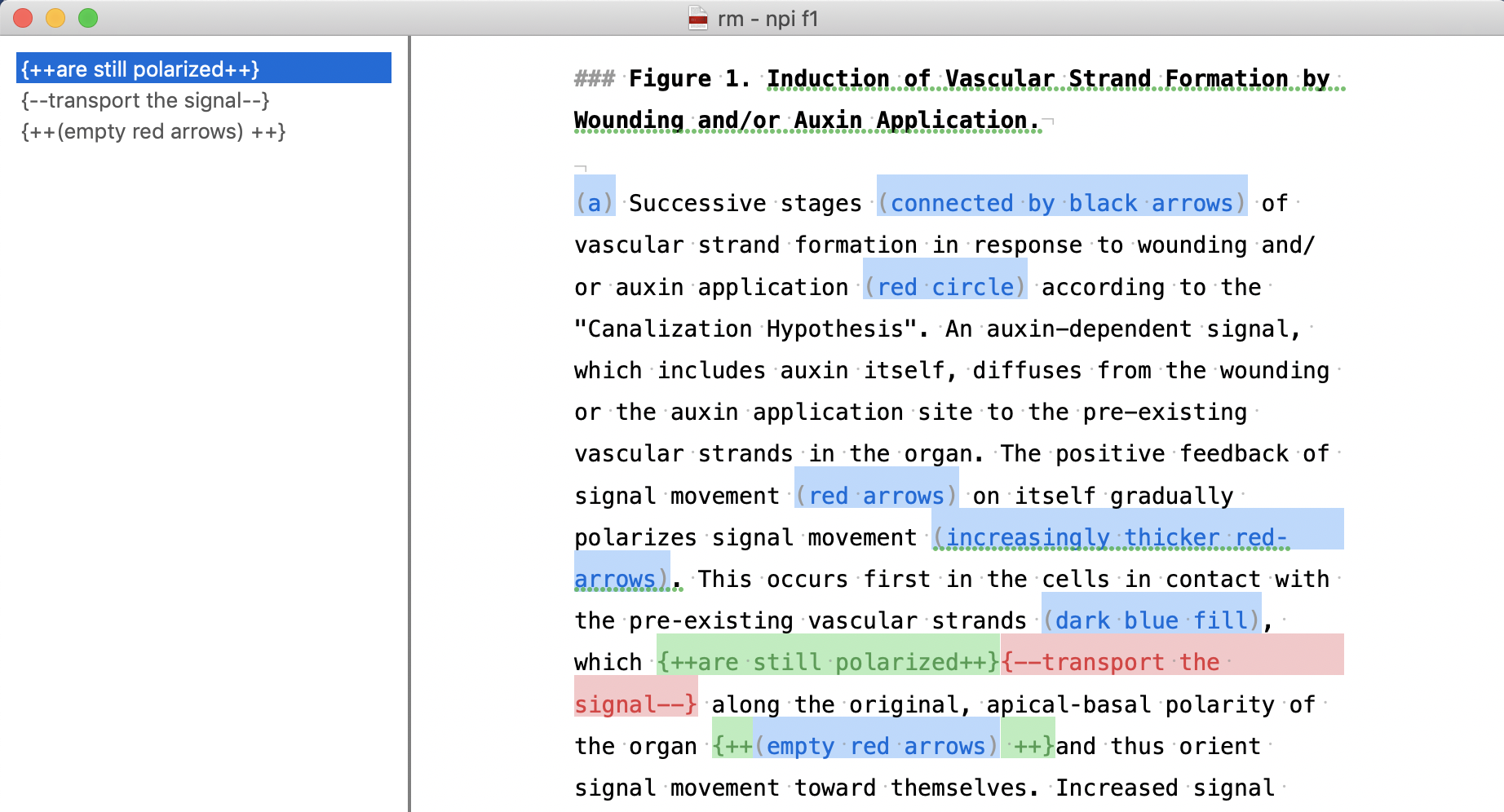
And here is what the sidebar looks like in nvUltra when an item is selected:
The font is still white but is now invisible because the background, except for a vertical line to the very left, is not blue. Is this a bug or is this the desired behavior?
3. I understand you would like to maintain the focus of nvUltra on plain text, but I would find it really useful if nvUltra could be externally integrated with a graph or a mind-map app -- e.g., iThoughts -- to display linked notes as a graph in which notes are nodes and links are edges. It seems already possible with, for example, a web app called Contexted (https://app.contexted.io).
Thank you for your consideration.
Best regards,
Enrico
-

1. nvUltra uses a newer text engine (libSmartText) which offers many improvements and changes over what I was doing with Composer. Part of this is that invisible characters are handled in a more "correct" way (e.g. using the proper font). They are shown using the color of the text, rather than a single gray color regardless of what colors you are using. Currently invisible characters are not controlled by the theme. I'll consider this for a future update.
2. Sidebars and search bars are handled differently in nvUltra. These changes will be "back-propogated" in a future version of Composer, but for now will have to handled separately. The table in nvUltra has much more flexibility than Composer.
3. Yes -- nvUltra is focused on plain text. It sounds like you are referring to something else, but Composer can use OPML or iThoughts file format for its files, allowing you to simultaneously edit a single file as plain text or as a mind-map. I do this not infrequently. That feature is not planned for nvUltra, but is available in Composer.
Thanks for the comments!!
0 -
Dear Fletcher,
Thank you for your prompt reply.
1. It's unfortunate you are planning to turn the markup of invisible characters in Composer from gray to black. I am not sure why you think the latter is more correct: while I may agree with you that the gray that it's currently used in Composer may at times be too subtle, the black that is used in nvUltra makes it impossible for me to readily separate visible from "invisible" characters from each another, and certainly much more difficult and fatiguing than in Composer ("invisible" is in quotation marks because after turning on the option "Show invisible characters", invisible characters are in fact visible). I think the move from gray to black would be a step back along the path of enhancing the accessibility options of Composer, which I thought were a priority for you, so I do hope you will consider offering the possibility to style the color of the invisible characters in both nvUltra and Composer. One of the things I appreciate the most of Composer is that it does not force me to use a specific typeface or an unusual markup syntax, as other apps do; instead, it allows different users, with different needs or preferences, to style it exactly, or almost, as they need it. Please don't change that.
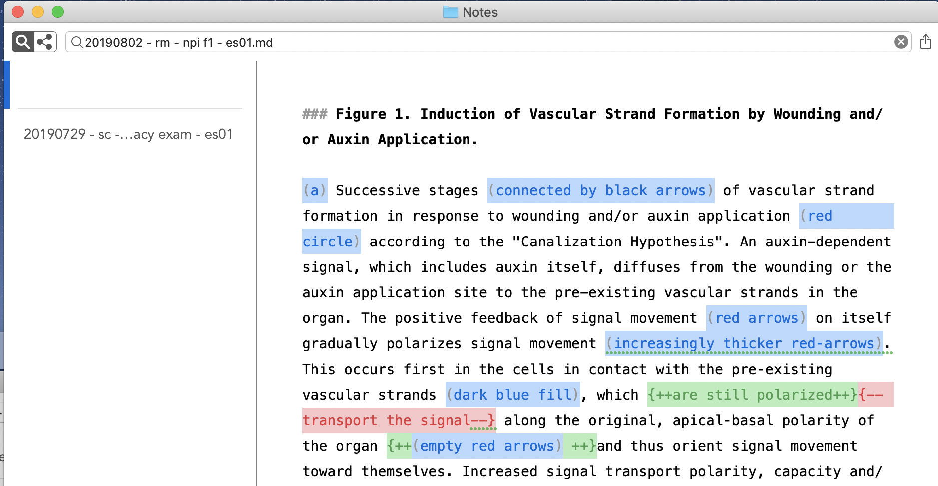
2. I am not sure I follow you. This are the parameters of the sidebar that can be styled according to nvUltra's default theme:
And these are those that can be styled in Composer's:
Could you please clarify in what way nvUltra's sidebar has more flexibility? How can I change in nvUltra the background of the sidebar when I select a note?
3. That's not what I meant; please let me clarify. Let's say I write this first note in nvUltra:

which links to this second note in nvUltra:

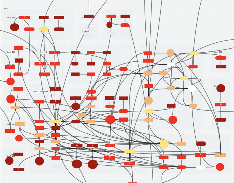
which, in turns, links back to the first one. Would there be a way to hook these notes to an external application such that the relation between them is displayed graphically, like so:
Thank you for your consideration.
Best regards,
Enrico0 -

Regarding #3, Ultra doesn't store those connections in any way. A [[link]] in a note simply triggers a search for its content. Thus, there's no data for any meaninfgul visual graph of connections. While I agree this would be cool, it would require a storage and indexing system that we've been actively working to avoid. Being able to just work with any and all files in any folder, and allow complete access/modification of all files from outside of Ultra precludes the ability to maintain a permanent indexed database of all contents.
0 -
Dear Brett,
Thank you for the helpful clarification: it now makes perfect sense that my feature request is incompatible with nvUltra philosophy to be able to work with any files and folders.
Because you found it cool, the notes and graph in my previous message were created with Contexted; if tweets are reliable source of information, they are preparing an app for all major OSs. Thank you for your consideration.
Best regards,
EnricoP.S. I am in no way associated with the developers of Contexted: I just stumbled upon the app by chance.
0 -
Thanks for sharing! I recall an app called TheBrain (I think) working in similar ways…
0 -
You are right, Brett. And there's, of course, the excellent Tinderbox, the app I use for my permanent notes:
I thought I would bring up the idea of linking nvUltra notes to an external mind-mapping app because I thought that was the direction you and Fletcher were heading toward -- the connectedness feature in nvUltra must have misled me... In any case, thank you for listening to and educating me.
I hope at some point you and Fletcher will also consider my points no. 1 & 2 above. Again, thank you for your consideration.
Best regards,
Enrico0 -
As to earlier points #1 and #2.
1. The markup wasn't changed from gray to black. It was changed from forcing all invisible characters to be gray, to using whatever font color your text is using. The invisible characters now match whatever colors you apply using the theme, even when you use different colors for different portions of the text. The old "you can use any color you want as long as it's gray" approach worked ok, until it didn't. If you used the same gray as your background color, the invisible characters would remain, well, invisible....
2. There will be more documentation about custom theming when the app is finalized, but for now you can use all of the built-in themes as examples of how the sidebar attributes are used in nvUltra. Change a few things and see what happens.
0 -
Thank you for getting back to me on those two remaining pints.
As to your response to point 1, you had already made clear that the color had not been switched from gray to black but to whatever color the font would be — the reason I mentioned black is simply because it was the color of the font in the screen shots I had attached to my opening post. In any case, the point I was raising is that, for example, trying to spot whether there are spaces where there should not be any is more difficult and fatiguing when the color of the dots with which spaces are displayed when they are made visible is the same as that of the font than if those dots were displayed in a color that contrasted with both the background and the font. Because it would be impossible for you to find a color with which to display invisible characters that stood out against all possible backgrounds and along all possible font colors the users would need or prefer, I thought the most sensible choice would be that of allowing the user to choose such a color; don’t you think?
0
Please sign in to leave a comment.
Comments
8 comments